
Tntroduction About Theme
How To Set Globle Setting
GLOBAL SETTINGS (IMPORTANT FIRST STEP)
Set global colors:
- Primary: #7B61FF (purple glow)
- Secondary: #00D4FF (cyan)
- Background: #0B0620
- Text: #FFFFFF
- Muted: #B0B0D0
Typography
- Headings: Poppins /
- Orbitron (futuristic)
- Body: Inter / Roboto
- Large heading: 60–90px
- Section titles: 32–48px
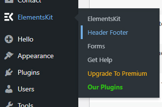
how to set-up Header and Footer
- Drag Site Logo widget
- Upload your logo (IMAGINEX)
- Adjust width (around 120–160px)
- Drag Nav Menu widget
- Select your menu (Home, Features, About, etc.)
- Drag Button widget
- Style:
- Background: gradient (purple → pink)
- Border radius: 8–12px
- Padding: 10–15px
- Style the Header
- Section settings:
- Background: dark (black/purple)
- Padding: ~15–25px top/bottom
- Make text white for contrast
How To Set Up All section
- Hero
- Logos
- Feature showcase
- Cards grid
- Workflow
- Features
- Showcase
- How It Work
- CTA
- Creators
- Pricing
- Review
- CTA
- Blog
- FAQ’s
- Get In Touch
Hero Section
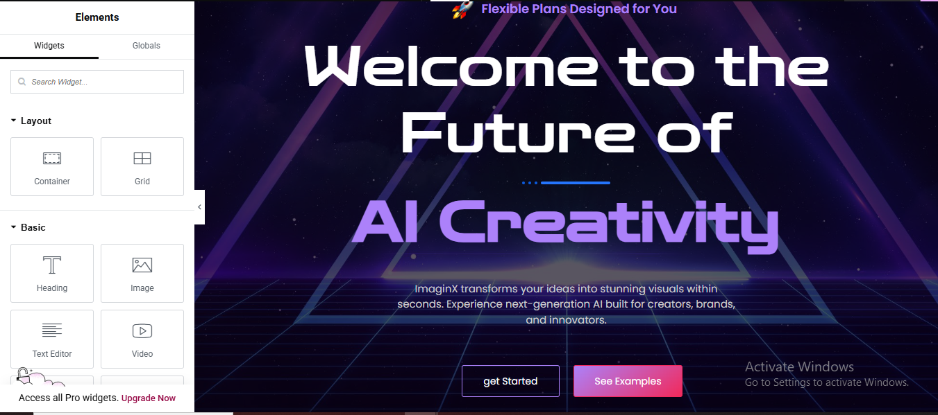
Layout
- Container: Full width
- Min height: 100vh
- Content width: 1200px
- Align: Center (vertical + horizontal)
Background
- Gradient: dark purple → black
Add overlay glow or grid image
- Widgets
- Heading
- Text:
- Size: 70px
- Gradient text (purple → blue)
- Text Editor
- Short description
- Button
- Text:
- Style:
- Background: gradient
- Border radius: 30px
- Hover glow
- Optional: small floating images/icons
Logo Section
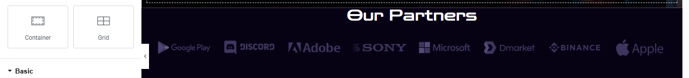
Layout
- Container: full width
- 1 row, multiple columns
- Widgets
- Add Image widgets for logos
- Set opacity: 50%
- Hover: 100%
Feature Show case Section
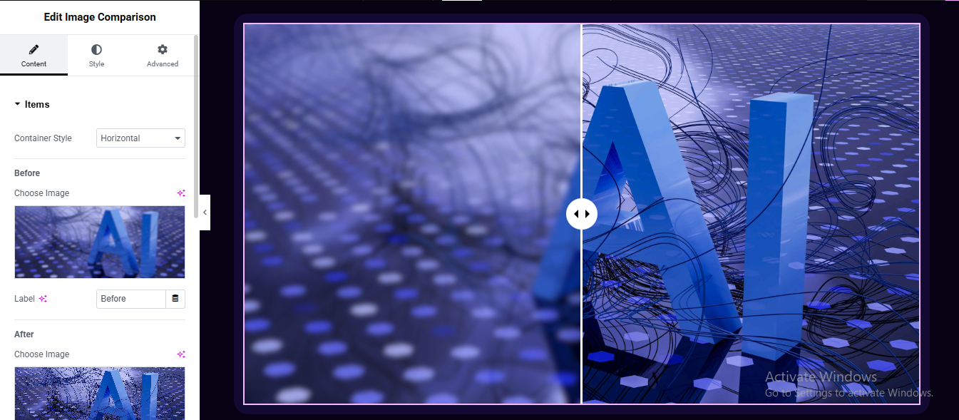
- Drag: Image Comparison
- Before Image → upload blurred/old image
- After Image → upload final/AI image
- Orientation: Horizontal
- Handle position: center (50%)
- Divider color: white/light
- Handle icon: arrows (⇄)
- Border radius: 15–20px
- Add shadow or glow (purple tone)
- Section Styling (Important)
- To match your design:
- Background: dark purple/black
- Add padding: 40–80px
- Optional: glowing border or gradient outline
Cards Grid Section
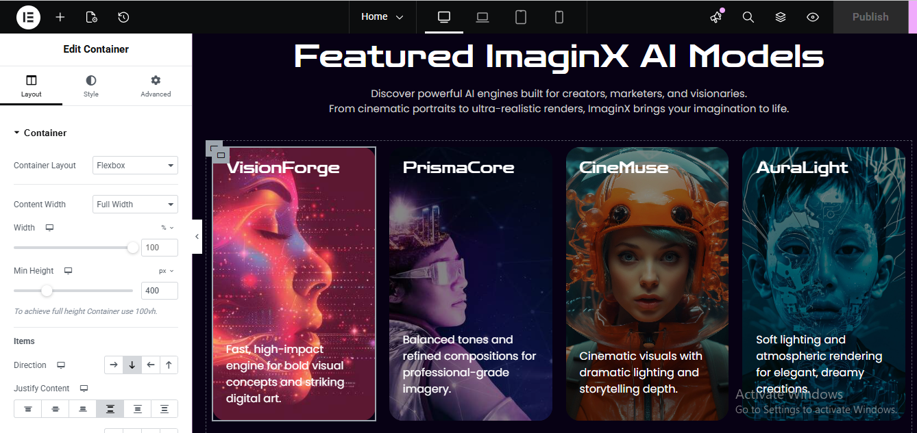
Layout
- 3–4 column grid
- Each Card
- Background: dark gradient
- Padding: 20px
- Border radius: 20px
- Hover:
- Scale: 1.05
- Glow shadow
- Content
- Image
- Title
- Short description
- style the all content
- same as for all features card
powerful Workflow Section
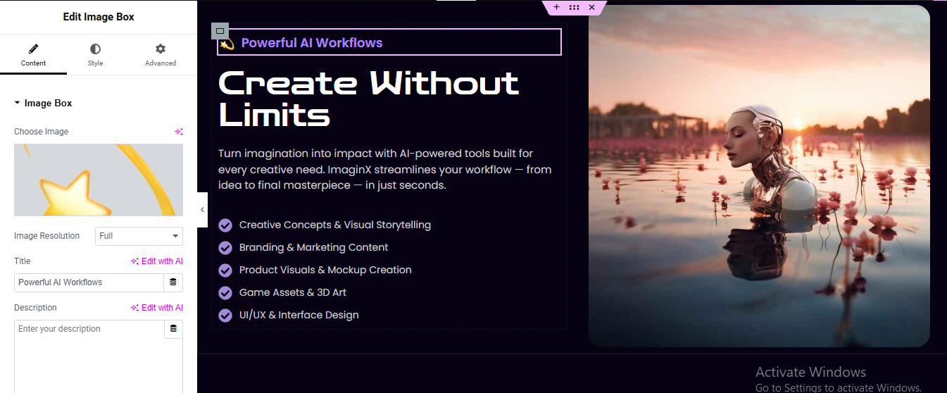
Edit your page with Elementor
- Click “+ Add Section”
- Choose 2 Columns (50/50)
- Small Top Badge (“Powerful AI Workflows”)
- Drag a Heading widget
- Type: Powerful AI Workflows
- Style it:
- Typography: small (12–14px)
- Text color: light purple / white
- Go to Advanced → Border
- Border Type: Solid
- Border Color: Purple
- Border Radius: 4–6px
Add another Heading widget
- Style:
- Font size: 48–64px
- Weight: Bold
- Color: White
Description Text
- Add Text Editor widget
- Paste your paragraph
- Style:
- Color: Light gray (#BFBFBF)
- Line height: 1.6
- Add the Right Image
Click the right column
- Drag in an Image widget
- Upload your image
- Style:
- Border Radius: 20–30px
- Width: 100%
Go to Advanced → Box Shadow
- Blur: 40+
- Color: subtle purple/black
Features Section
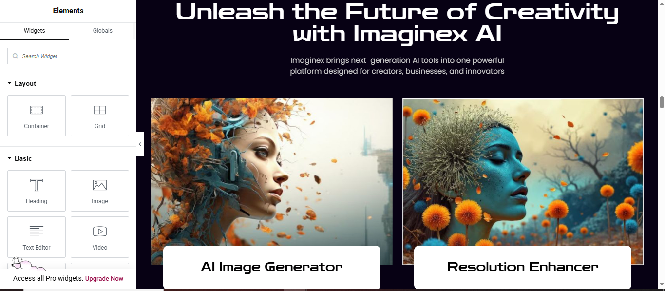
Add the Heading Area
- Drag in a Heading widget
- Create the Two Feature Cards Layout
- Add a Container inside the section
Set:
- Direction: Row
- Gap: 20–30px
- Justify Content: Center
Add Images
- Inside each column:
- Drag an Image widget
- Upload your feature image
- Create the Bottom Label Box
Add another Container
- Set:
- Background: White
- Padding: 20–30px
- Border Radius: 12–16px
Add the Floating Card Effect
- Select the white box container:
- Go to Advanced → Box Shadow
- Blur: 20–40
- Spread: 0
- Color: rgba(0,0,0,0.2)
Showcase Section
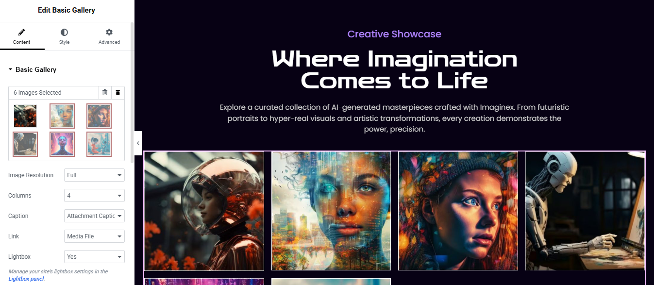
Open your page with Edit with Elementor
- Click ➕ Add Section
- Choose 1 Column layout
Drag Heading widget for Small top label
- Color: light purple / accent
- Typography:
- Size: ~16–18px
- Weight: Medium
- Letter spacing: slight (1–2px)
Add another Heading widget below for main title
- Alignment: Center
- Size: ~48–64px
- Weight: Bold
- Color: White
Drag Text Editor widget for description text
Drag Basic Gallery widget
- Columns: 4
- Image Size: Full
- Lightbox: Yes
- Spacing: adjust (10–20px looks clean)
- Section styling (gallery section):
- Background: same dark color
- Padding:
- Top: 20–40px
- Bottom: 80px
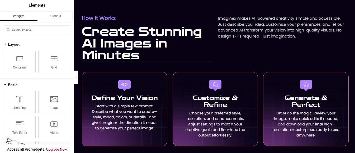
How It Work
Click ➕ Add Section
- Choose 1 Column
- Go to Layout
Add Heading widget for samll label
- Color: purple (#a855f7)
- Size: 16px
Add another Heading for main title
- Color: White
- Size: 48–64px
- Weight: Bold
- Line height: 1.2
Add Text Editor widget in right column
Create the 3 Feature Cards
- Add Iconbox widget
- Choose any icon (eye, chat, AI, etc.)
- Style:
- View: Stacked
- Shape: Rounded
- Color: White
- Background: purple gradient
- Add Heading
- Color: White
- Size: ~20–24px
- Add Description
- Color: #cfcfe8
- Size: 14–16px
Style the Cards
- Background:
- Gradient:Start: #1a0f3d End: #0b0620
- Border:
- Width: 1px
- Color: #ff4ecd (pink/purple glow style)
- Radius: 20px
- Padding: 30px all around
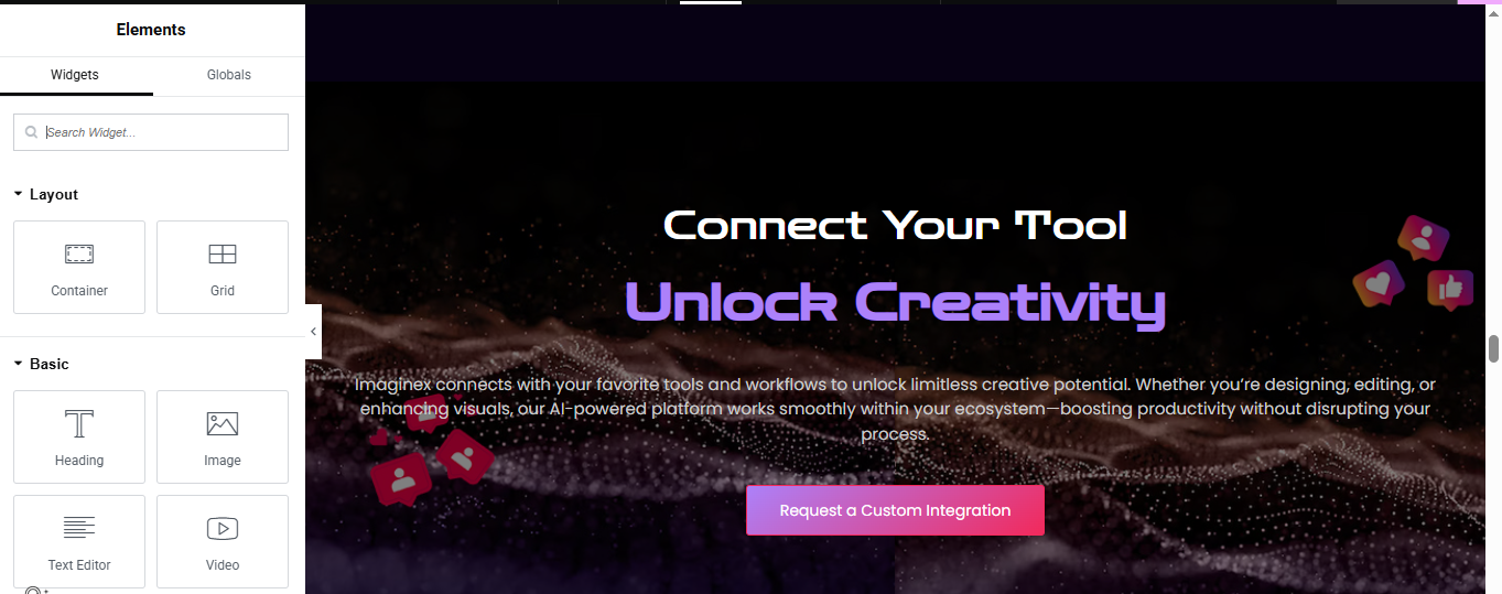
CTA Section
Click ➕ Add Section
- Choose 1 Column
- Add Background Image + Overlay
Background Image:
- Go to Style → Background
- Choose your abstract/wave image
Dark Overlay (important for readability):
- Style → Background Overlay
- Color: #0b0620 (dark purple/black)
- Opacity: 0.7–0.85
Small Heading (Top Text)
- Widget: Heading
- Alignment: Center
- Color: White
- Size: 20–24px
Add another Heading for main heading
- Style:
- Alignment: Center
- Size: 48–64px
- Weight: Bold
Add Text Editor for Description Text
- Style:
- Alignment: Center
- Color: #d1d1e0
- Size: 16–18px
- Line height: 1.6
Add Button widget Add CTA Button
- Alignment: Center
- Background: Gradient
- #ff4ecd → #ff6a88
- Text Color: White
- Border Radius: 8–12px
- Padding: 14px 28px
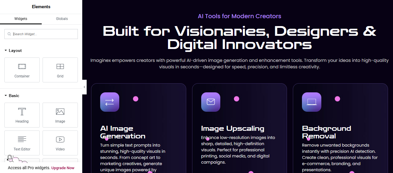
Creators Section
Click ➕ Add Section
- Choose 1 Column
- Go to Layout
Add Heading widget for samll label
- Color: purple (#a855f7)
- Size: 16px
Add another Heading for main title
- Color: White
- Size: 48–64px
- Weight: Bold
- Line height: 1.2
Add Text Editor widget
Create the 3 Feature Cards
- Add Iconbox widget
- Choose any icon (email, direction arrow, laptop, etc.)
- Style:
- View: Stacked
- Shape: Rounded
- Color: White
- Background: purple gradient
- Add Heading
- Color: White
- Size: ~20–24px
- Add Description
- Color: #cfcfe8
- Size: 14–16px
Pricing Section
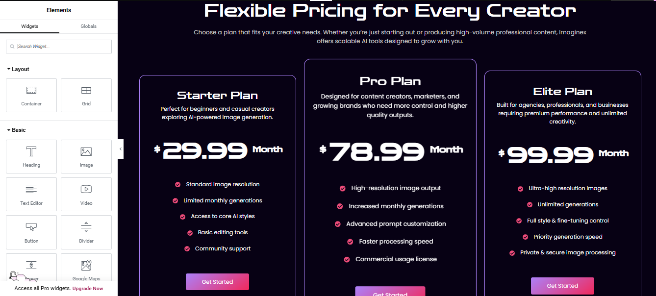
Click “+ Add Section” → choose 3 columns
- Go to Section Settings (6 dots icon)
- Layout → Content Width: Full Width
- Column Gap: Wide
- Min Height: ~600–700px
- Style tab → Background:
- Set a dark gradient (e.g., deep purple → black)
Add the Heading Area (Top)
- Above the pricing boxes, add a Heading widget
- Alignment: Center
- Typography: Large (40–60px)
- Color: White
Add a Text Editor widget below it for the subtitle
- Make text slightly dim (light gray)
- Design One Pricing Card (Then Duplicate)
- Work on the first column, then duplicate it later.
- Add a Container (Card Look)
- Click column → Style tab
- Background: dark (slightly lighter than section)
- Border:
- Solid, 1px
- Color: purple/blue glow
- Border Radius: 15–20px
- Padding: 30–40px
Plan Title + Description
- Add Heading widget
- Add Text Editor
- Style both:
- Center align
- White text
Add another Heading widget for price
- Features List
- Add Icon List widget
- Add items like:
- Icon
- Text color: white
- Spacing: comfortable (line height ~1.8)
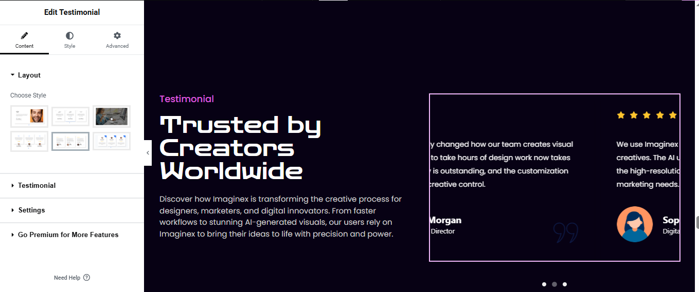
Review Section
Click “+ Add Section”
- Choose 2 columns (Left + Right)
- Left Side (Heading + Description)
Add Heading widget for small heading
Add another Heading widget for main title
Add Text Editor widget for Description text
Right Side (Testimonial Card / Slider)
- Drag Testimonial Carousel widget
- Add testimonials:
- Name, Title (e.g., Director), Review text, Image/avatar
Customize Layout
- Layout: Card / Skin
- Alignment: Left
- Show dots: ON
Background & Border
- Background: dark (slightly lighter than section)
- Border:
- 1px solid purple/blue
- Border radius: 15–20px
- Padding: 25–30px
CTA Section
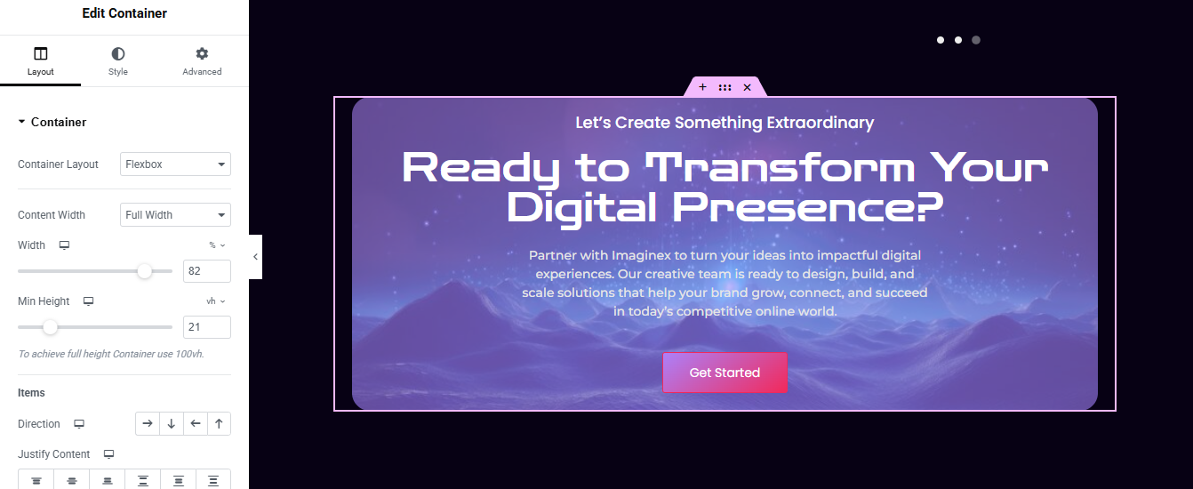
Edit your page with Elementor
- Click “+” → Add Container
- Set Background (Gradient + Image)
- Go to Style → Background
- Choose Gradient
- Color 1: Purple (e.g. #6a5acd)
- Color 2: Dark blue (#1e1e3f)
Drag in a Heading widget for small title
Add another Heading widget for main heading
Drag a Text Editor widget for short description
Drag a Button widget for add CTA Button
- Background: Pink/Red gradient
- Border radius: 8–12px
- Padding: 12px 28px
- Spacing & Polish
- Heading: 20px bottom
- Paragraph: 20–30px
- Button: 30px top
- Optional: Add Floating Dots / Effects
- Use Style → Background Overlay → Pattern or SVG
Blog Section
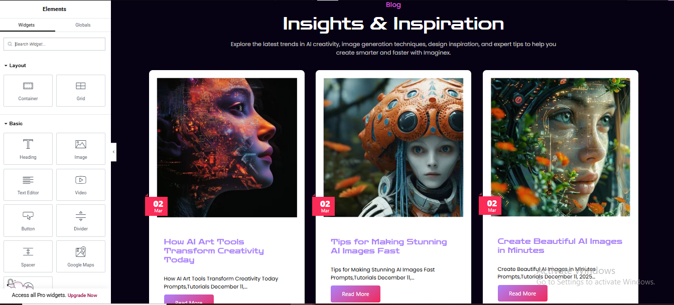
Click “+” → Add Container
- Add Heading + Subtitle
- Drag Posts widget for added post
- Layout settings:
- Skin: Classic or Cards
Columns: 3
Posts Per Page: 3
Style the Cards
- Go to Style tab:
- Card
- Background: White / light gray
- Border radius: 12–20px
- Box shadow: Soft shadow
- Image
- Image size: Medium/Large
- Border radius (top corners only)
- Title
- Color: Purple/blue
- Typography: Bold
- Size: ~18–22px
- Excerpt
- Color: Gray
- Limit length (10–15 words)
- Button
- Text: “Read More”
- Background: Gradient (pink → purple)
- Border radius: 6–10px
FAQ Section
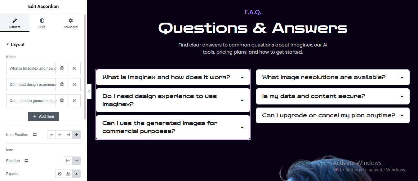
Click “+” → Add Container
- Add Section Heading
- Add Heading widget for small heading
- Add another Heading for main title
- Add Text Editor for Short Description
Create 2-Column Layout
Add Accordion Widgets
- Style Accordion (Important)
Title (Closed State)
- Background: Light gray (#f1f1f1)
- Text color: Dark
- Border radius: 8–12px
- Padding: 15–20px
Active/Open Item
- Background: White
- Slight shadow or border
Content
- Background: White
- Text color: Gray
- Padding: 15–20px
Icon
- Position: Right
- Icon: Chevron or arrow
- Color: Dark
Get In Touch Section
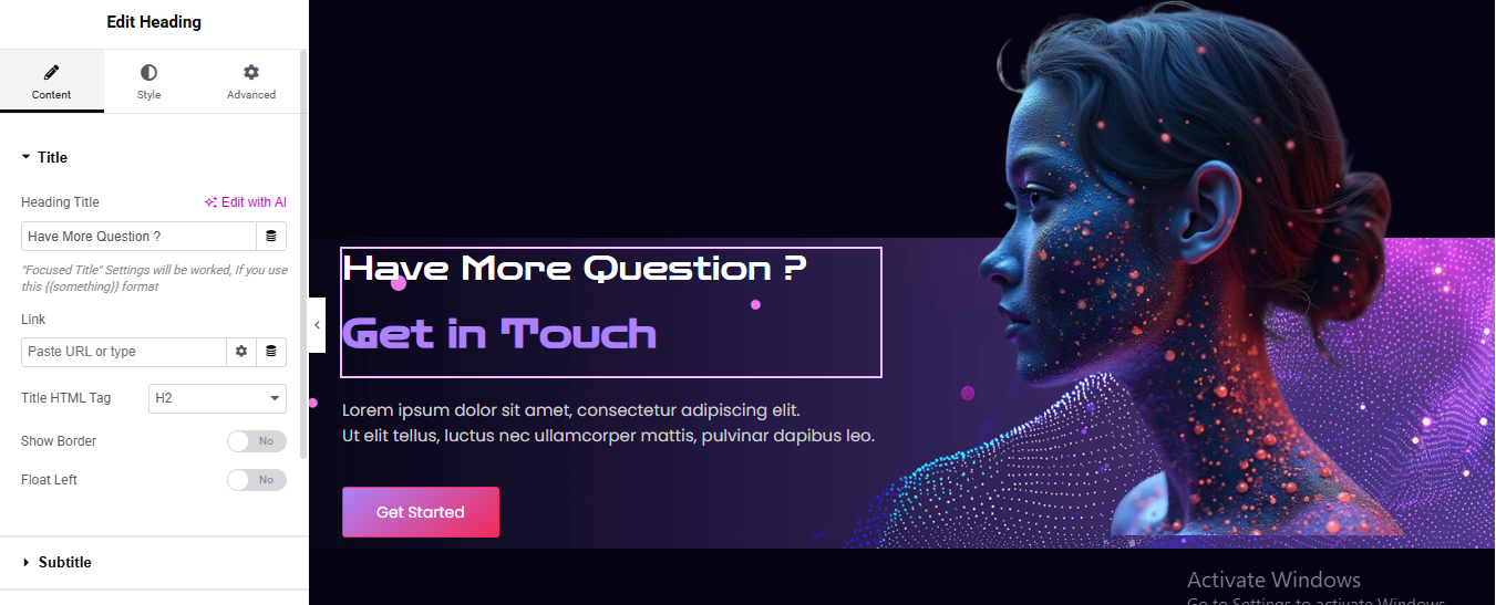
Edit your page with Elementor
- Click “+ Add Section”
- Layout settings
- Content Width: Full Width
- Column Gap: No Gap
- Min Height: ~500–600px
- Vertical Align: Middle
Background styling (important for the glow look)
- Go to Section → Style:
- Background Type: Gradient
- Color 1: Dark purple/blue (#0b0220)
- Color 2: Slightly lighter purple (#1a0f3d)
- Angle: ~120°
Right column (image)
- Add Image widget
- Left column (content block)
- Add a Heading widget:
Add another Heading widget: Main heading with border box
- Color: Light purple / neon (#a855f7)
- Typography:
- Size: 40–60px
- Weight: Bold
Add the box around it:
- Go to Advanced → Border:
- Border Type: Solid
- Width: 1–2px
- Color: Light purple (#a855f7)
- Padding: ~20–30px
- Margin bottom: ~20px
Add Text Editor widget: Description text
Button
- Background: Gradient (pink → purple)
- Border radius: 6–10px
- Padding: 12px 28px
Spacing & alignment
- Left column padding: ~60px
- Right column padding: 0
- Keep everything vertically centered
Conclusion
Building a complete, modern landing page like this in Elementor is entirely achievable when you break it down into structured sections—hero, features, galleries, pricing, testimonials, CTA, and footer. The key is consistency in spacing, colors, and typography, along with smart use of gradients, background images, and responsive layouts.
By combining Elementor’s core widgets with advanced styling (like overlays, motion effects, and custom CSS if needed), you can recreate a visually rich, high-converting design without touching code. Focus on clarity of content, strong visual hierarchy, and mobile responsiveness to ensure the page performs well across all devices.
Once your sections are built, save them as templates for reuse, optimize images for speed, and refine interactions to give the site a polished, professional feel. With practice, you’ll be able to design pages like this faster and with even more creative control.